Back to projects

One design system for
two opposite audiences

Doryn is where a school photographer runs a season: upload the shoot, set the prices, and every family gets a shop with only their own child(ren) in it.

The same product, then, is the tool one professional lives in and the shop a few hundred families pass through.

My scope was the system, not the product: build the design language, ship it as code, and hand it to the developer who builds on it.

One component, two worlds

A dark, dense workspace for the photographer. A light, calm shop for the parents. Two audiences that share nothing: not the device, not the mood, not the skill level.

Three hundred photos to sort before the weekend, in a studio with the lights down, every week of the season. Against that, four minutes on the school run, and nothing until next year.

Two faces, then, but not two products. Switching theme swaps a single attribute on the page, and every surface, every shadow, every text role follows: the same button, the same card, the same drawer, in the studio and in the shop.

Drag the slider to cross from one to the other.
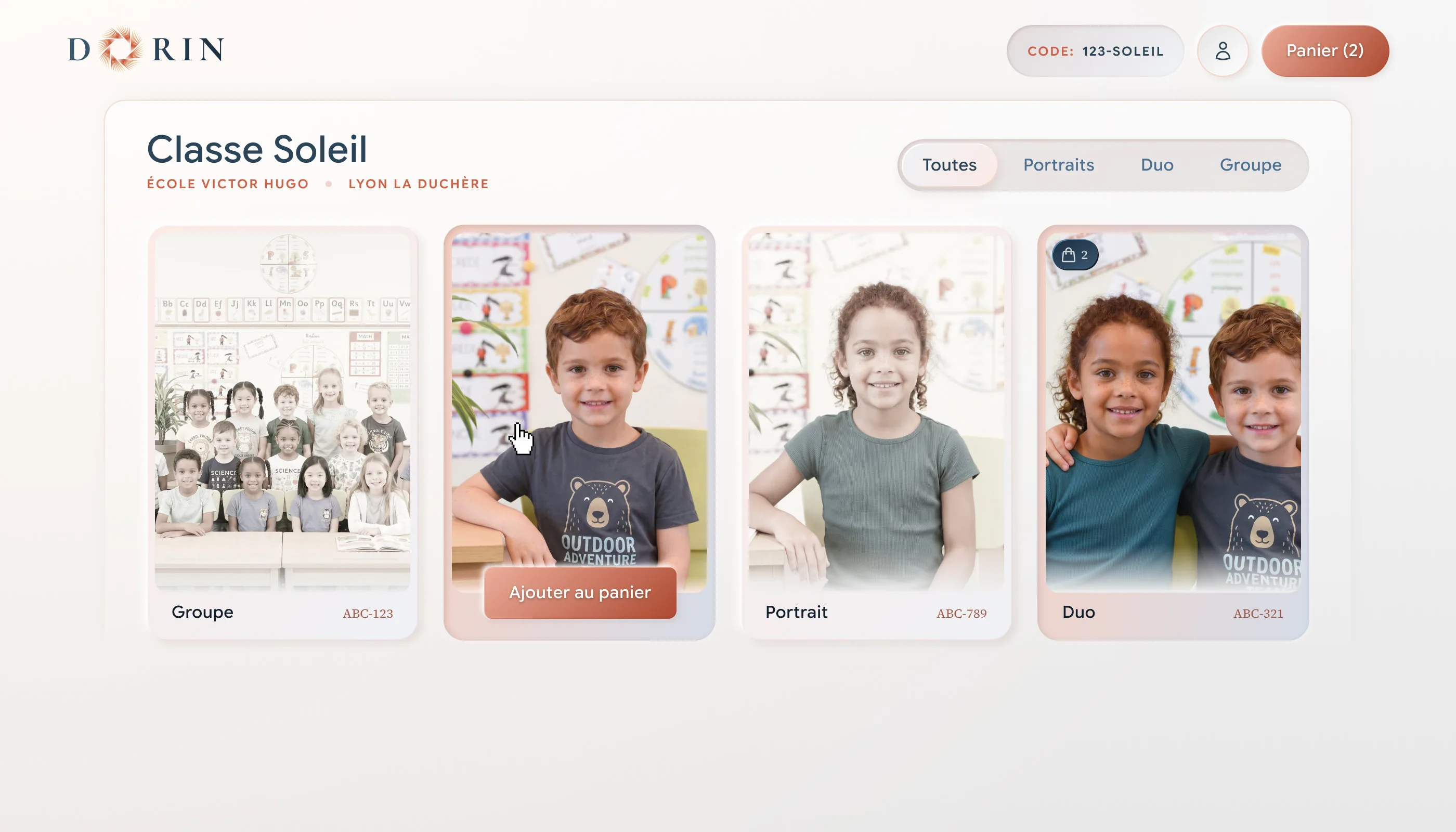
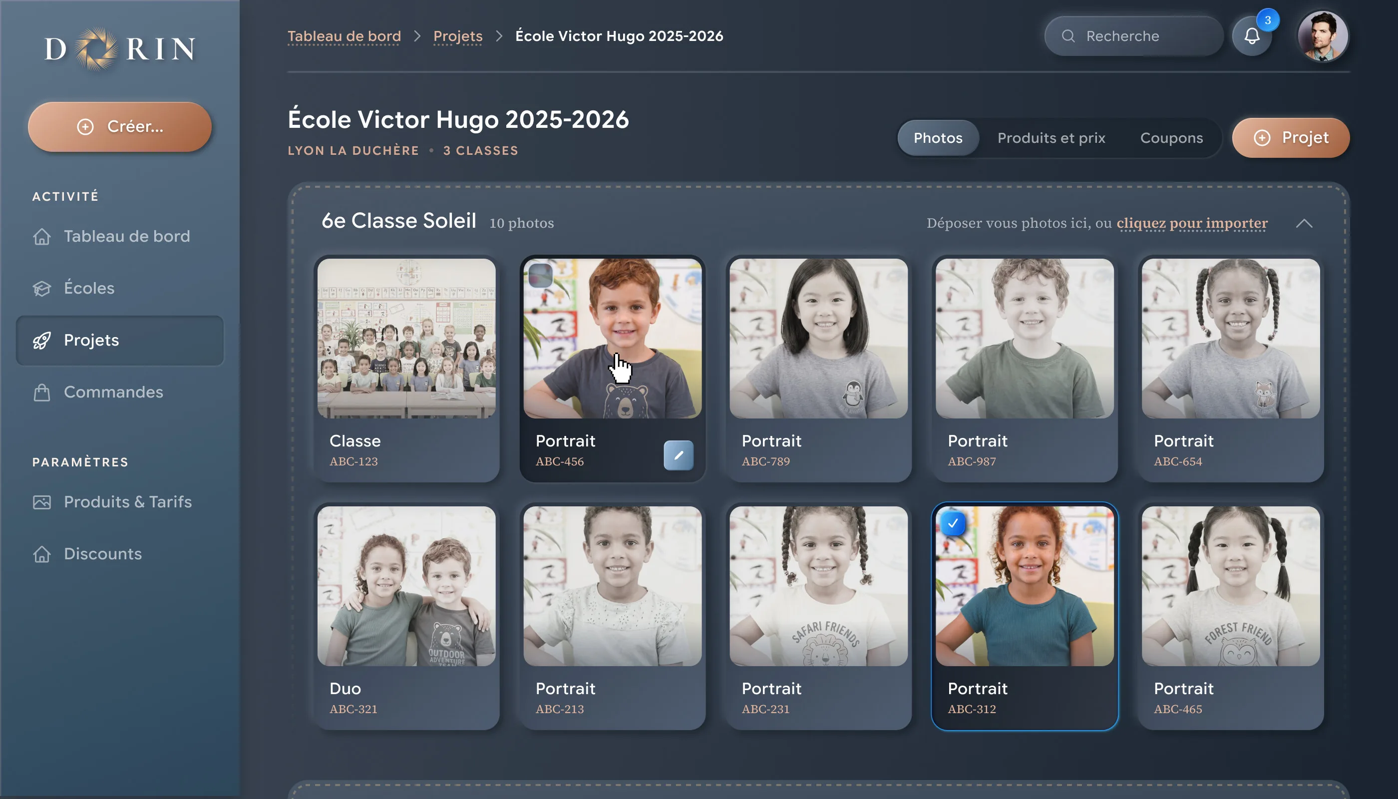
Doryn, the parent side: the photo store on a light theme

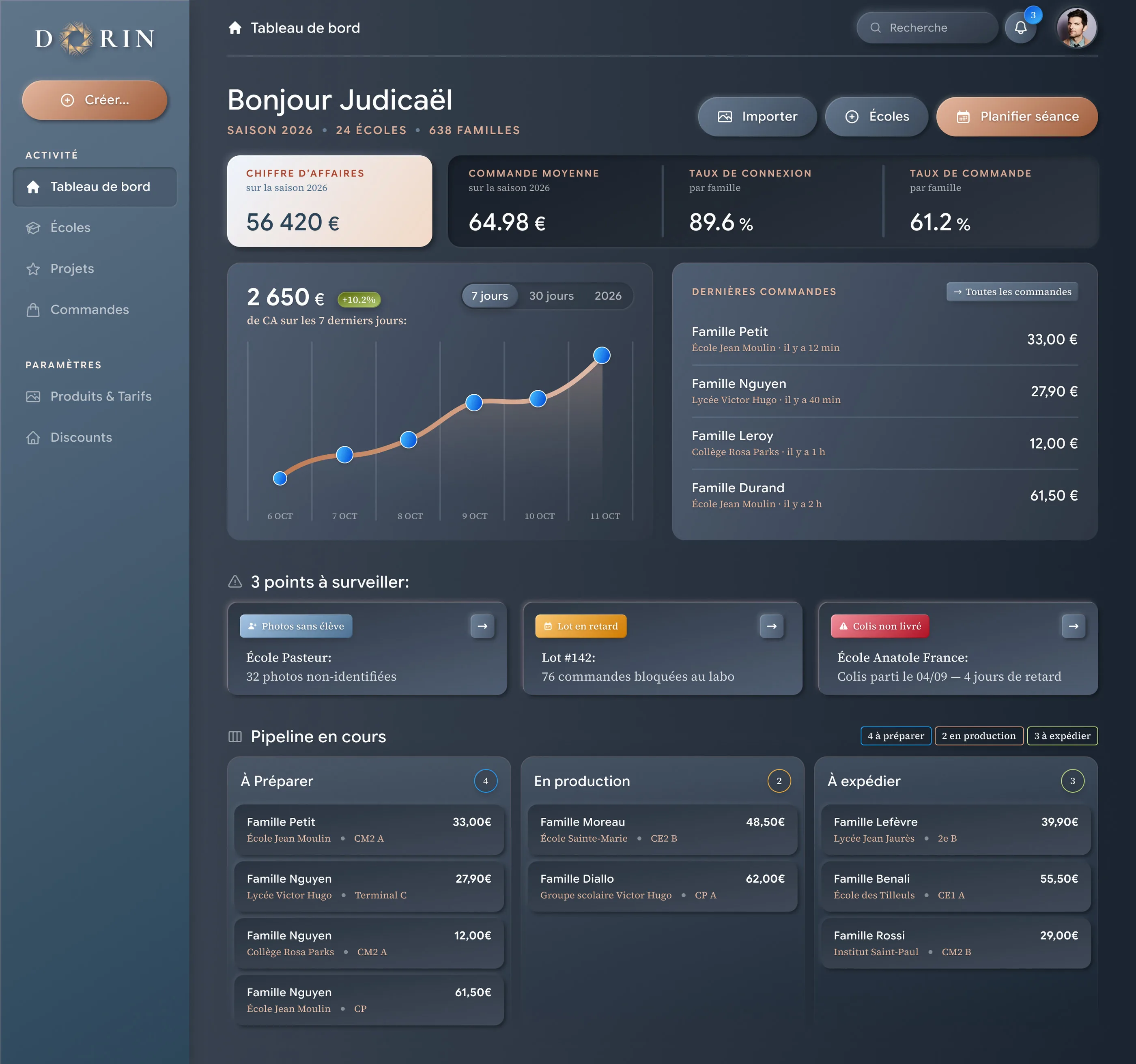
Where the season is, in one screen

The photographer’s day does not start with photos. It starts with money and deadlines: what the season has made so far, which photos still have no pupil attached, which batch the lab is sitting on, which parcel never arrived.

So the home screen is a status board, not a gallery. Season revenue and the week’s trend, the last orders in, the three things that need a decision today, and the whole pipeline by stage. Everything else is one click away.

It is also the densest screen in the product: stat tiles, a trend chart, segmented controls, status chips, count badges, list rows and a three-column pipeline. It is built entirely from the design system, without a single line of custom CSS.

Doryn photographer dashboard, dark theme

A design system that developers can use, not just read

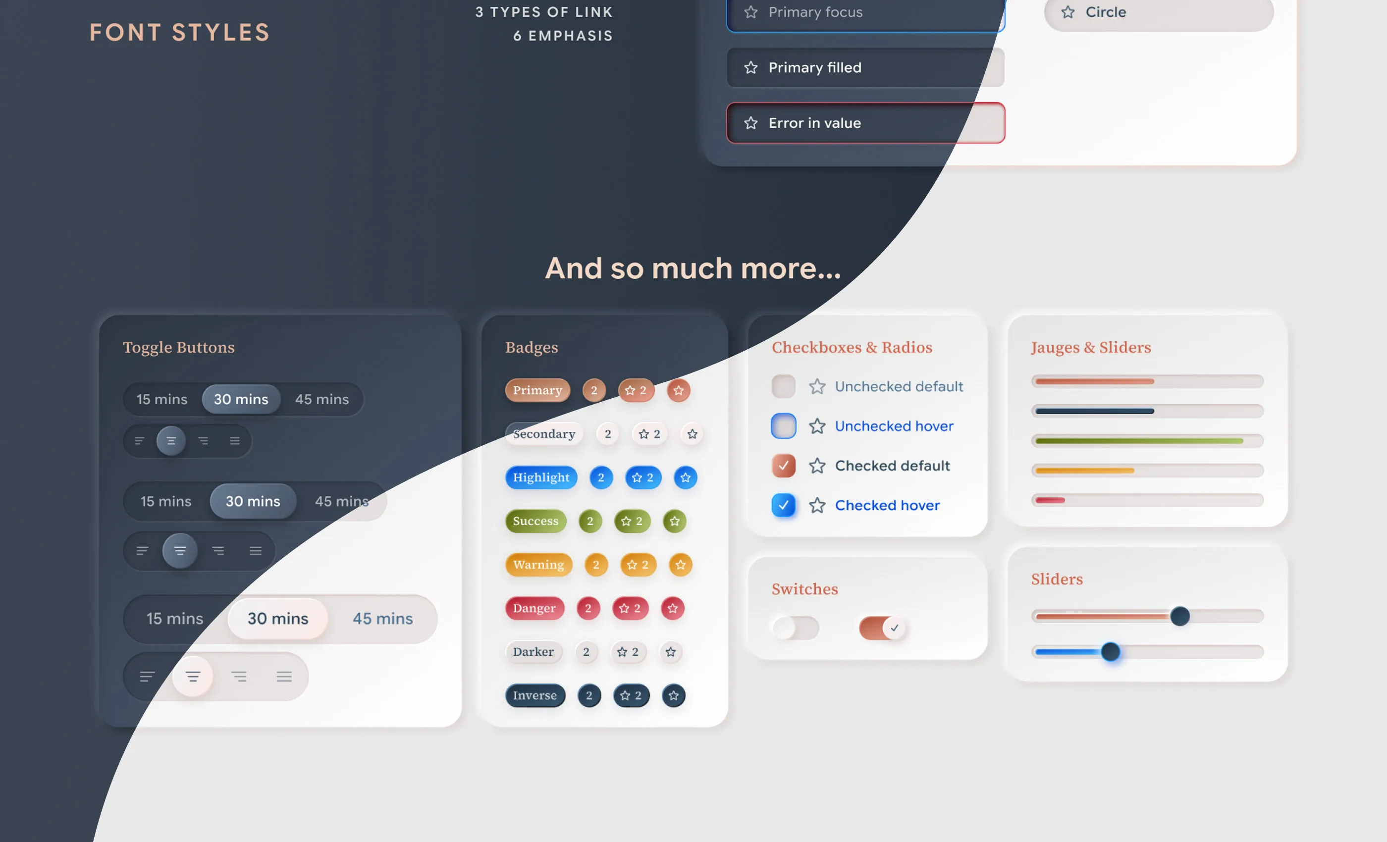
The deliverable was never a Figma file. It is a living HTML/CSS reference site, built on tokens, with a PHP partial for every component: a folder the developer drops into the project and uses as is.

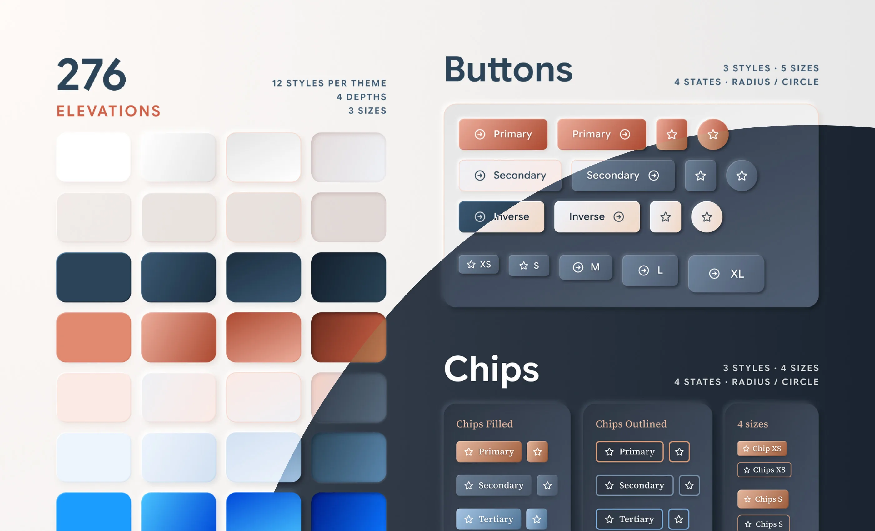
Why so many surfaces and elevations: the two sides of Doryn are told apart by light, not by colour. The studio is lit from a dark room, the shop from a white one. The same convex button has to read as raised in both. That is a job for a system, not for a palette.

And the rule that holds it together: the code copies the Figma. Nothing invented, recalculated or rounded. A script reads the styles back from the file and compares them to the CSS variables, one by one. Zero drift.

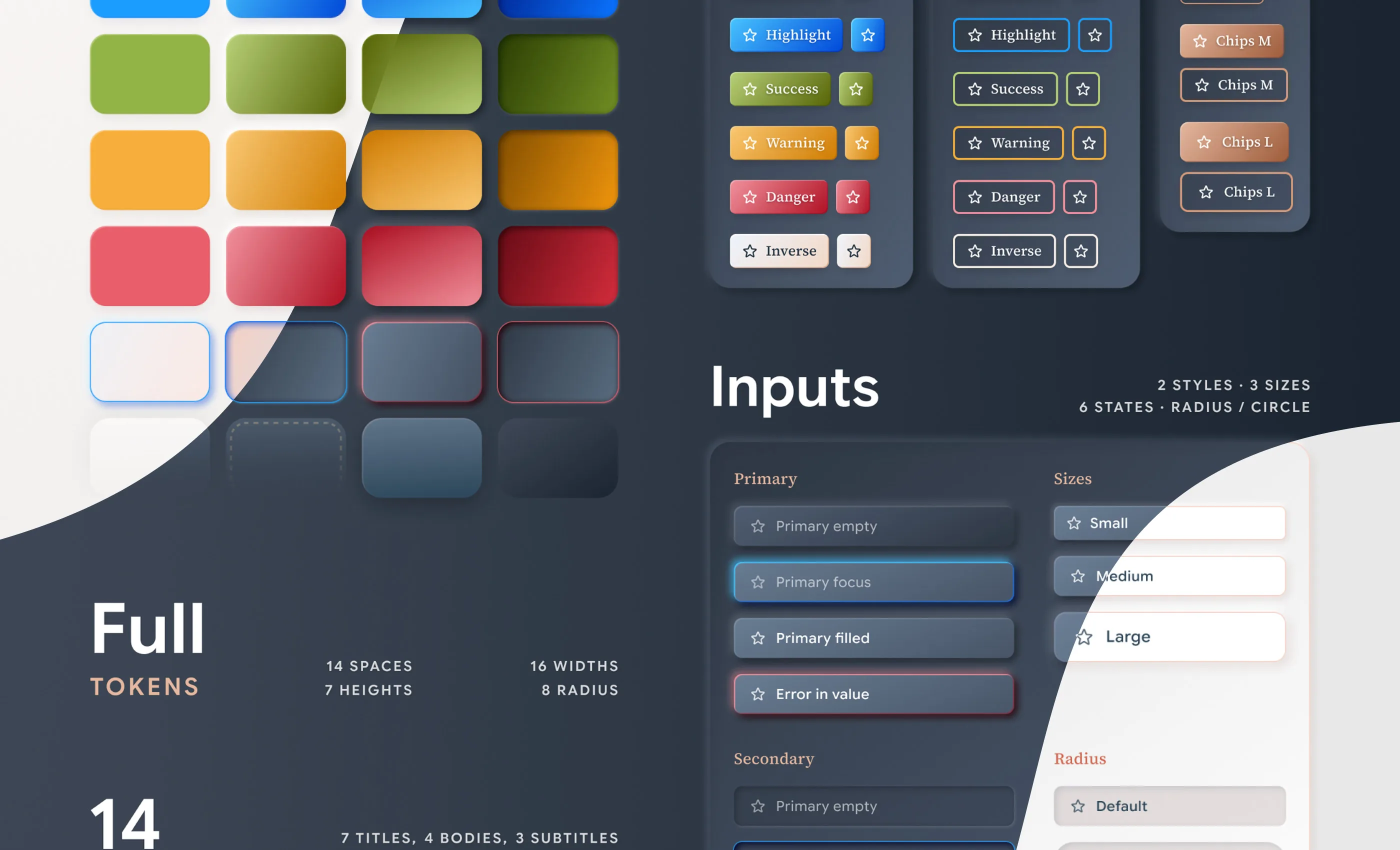
Doryn design system: 276 elevations, buttons and chips, in both themes Doryn design system: colour ramps, tokens and input states Doryn design system: type styles, toggles, badges, checkboxes, switches, gauges and sliders

Four minutes, anywhere, once a year

The other side of the product, and the opposite of the dashboard in every way: no density, no training, no second visit. A parent will not learn this interface. They get a code on a paper slip, they type it, they look at photos of their own child, they buy, they leave.

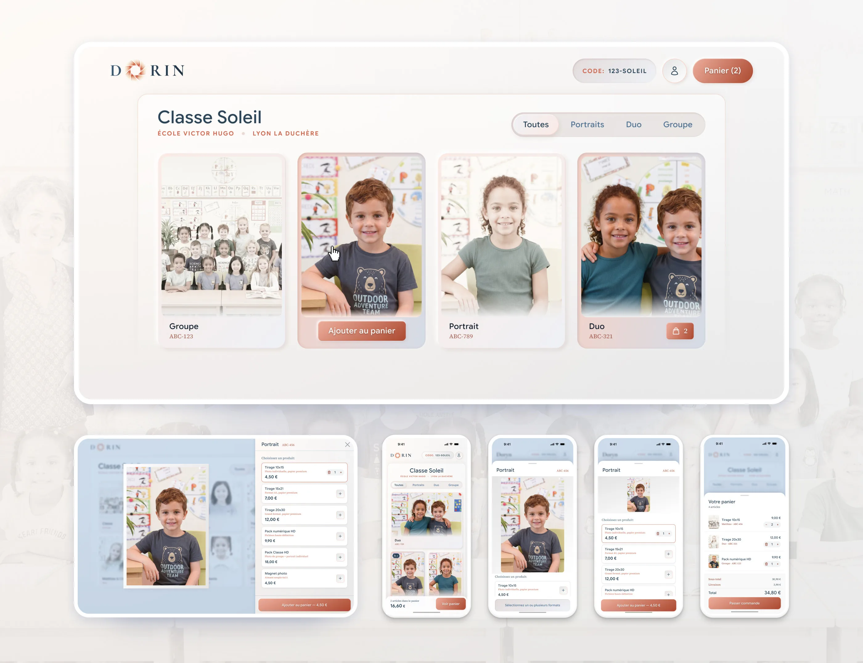
So the journey has five screens and no account creation: the code, the gallery, the photo, the basket, the payment. The photo is the product, so the photo takes the screen: tap it and it opens full width, with the price list beside it on desktop and under it on mobile.

The same drawer that shows a product list on a laptop becomes a sheet on a phone. Same component, same tokens, a different geometry.

These screens were not the commission. They are what a system is for: proof that it holds a real journey, on a real device, without a single component being bent to fit.

The parent side of Doryn: the class gallery on a laptop, and the same journey on a phone: gallery, photo with its price list, and basket

Built to be handed over

Doryn has a developer, and he was never going to open Figma to find a shadow value. So the system ships the way he works: a folder in the project, one partial per component, parameters named exactly like the Figma variants, four sets of dimensions from a notebook to an iMac.

That is the whole job: the next person builds screens I have never seen, and they look like Doryn.

My part is done. The foundation is laid, and the product is being built on it now.