Back to projects

Full redesign and coded
design system for an AI
market intelligence app

Same features, a calmer product: rethinking the architecture of IceInsights, then giving it one personality and the design system to keep it.

IceInsights watches your market for you. Describe your business, and it monitors competitors, trends and local signals, then delivers a curated digest: three signals worth your attention, out of hundreds analyzed. When something big happens, it alerts you.

A smart product, with a real problem: it didn’t look or feel like one product.

More than “make it beautiful”

The mission started as a UI job: give IceInsights a look worthy of its concept. The first screen changed the scope. A product meant to be simple did not look simple anymore: it looked complicated, and not only because a nice UI was missing. What it lacked was structure: a strong information architecture, a real hierarchy, things in their right place.

So while I explored a modern, iced UI, I rebuilt the architecture in parallel. Same features, but reorganized and ranked. Everything went back where it belongs, with the hierarchy it deserves. A supposed simple, clean product made simple and clean again.

Drag the slider and see for yourself.
IceInsights before the redesign

Then the foundation: a design system, shipped as code

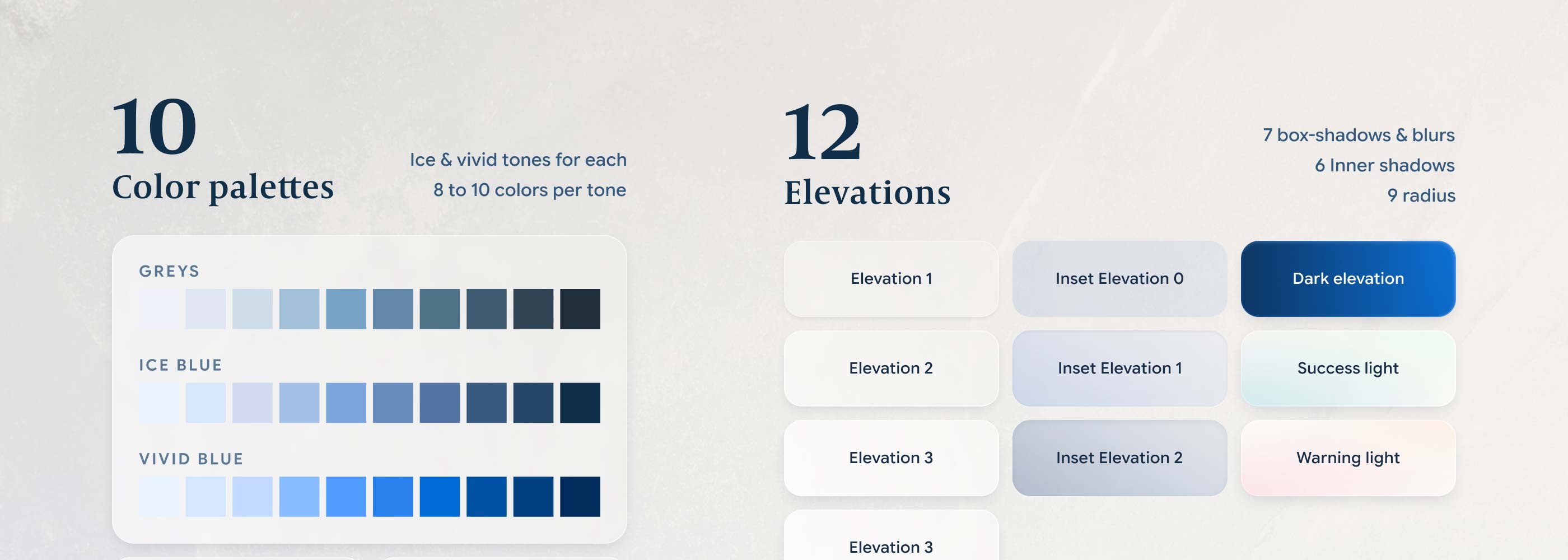
With the architecture settled, I rebuilt the visual language around the one idea the product already owned: ice. Frost surfaces, glacial blues, measured light. And I locked it all into a design system. Not a Figma file: a living HTML/CSS reference site, built on tokens and variables, ready for developers to use as is.

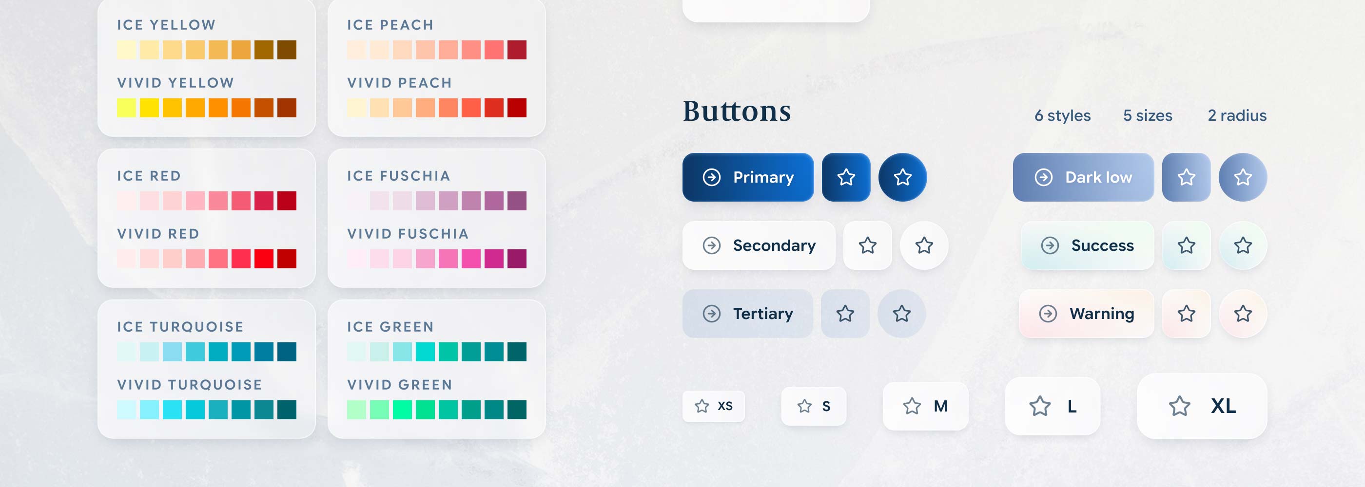
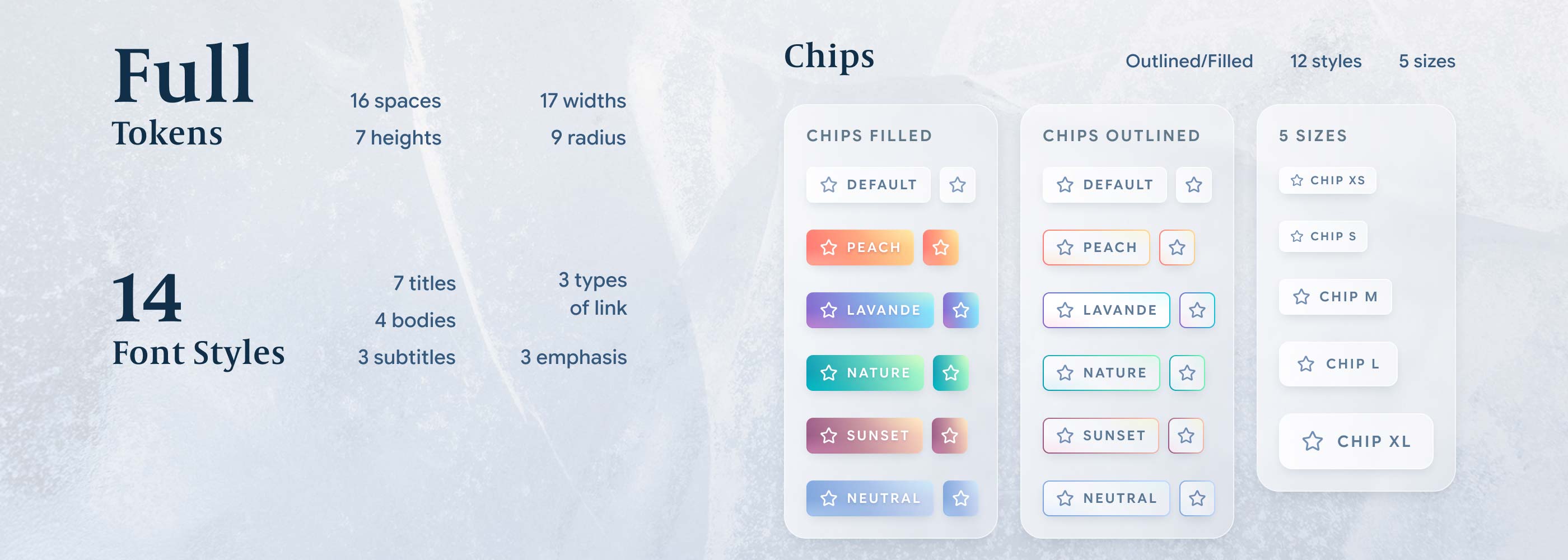
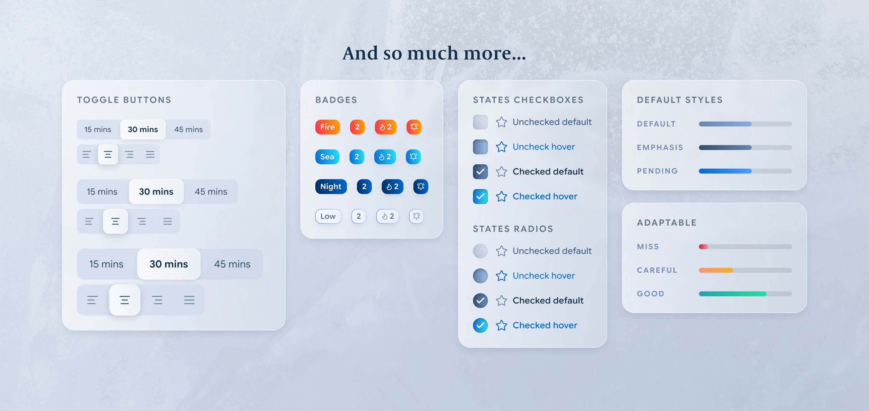
Two nestable theme axes, light and dark. Color ramps calibrated on measured luminance, so every scale behaves the same. A full type ramp, spacing on a 4px grid, seven control heights, nine shadow levels. Motion with a personality: the glass settles, it never slams. And every component documented and coded, every state included, from buttons (7 styles, 4 sizes, 3 shapes) to fields, chips, navigation, gauges, steppers and popovers. All of it finished to a premium standard: the kind of polish you feel before you can name it.

IceInsights design system: color palettes and elevations IceInsights design system: buttons and controls IceInsights design system: chips, fields and components IceInsights design system: tokens and type ramp

Onboarding: ask one thing

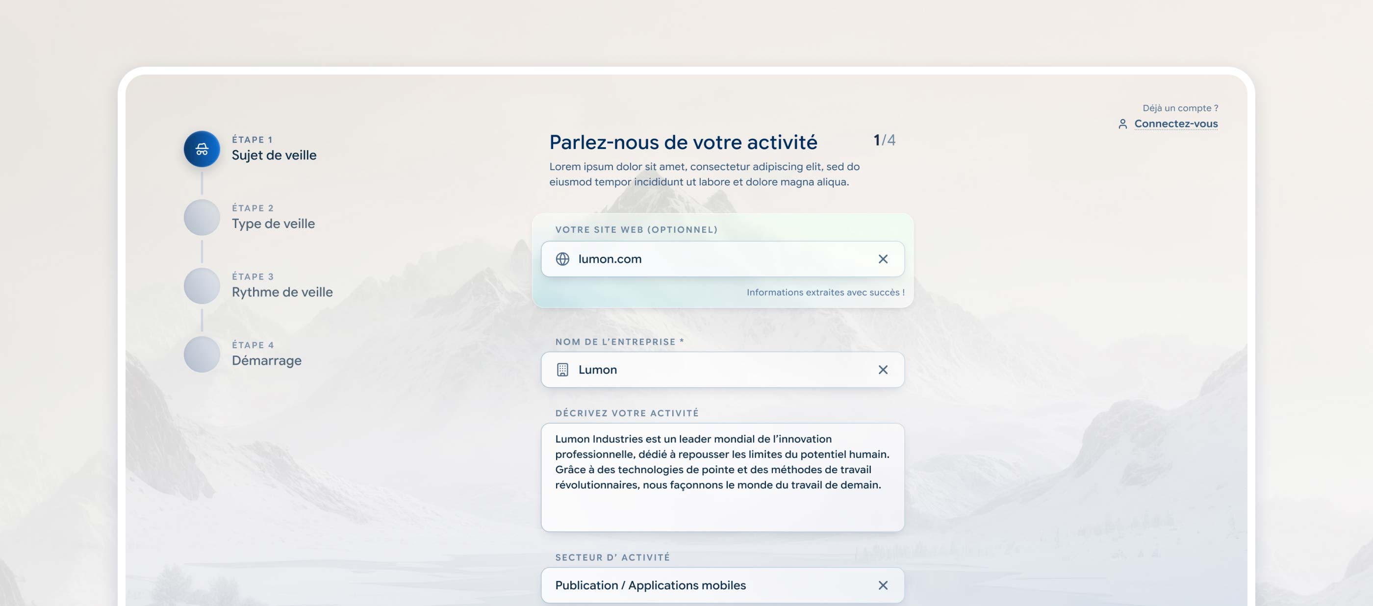
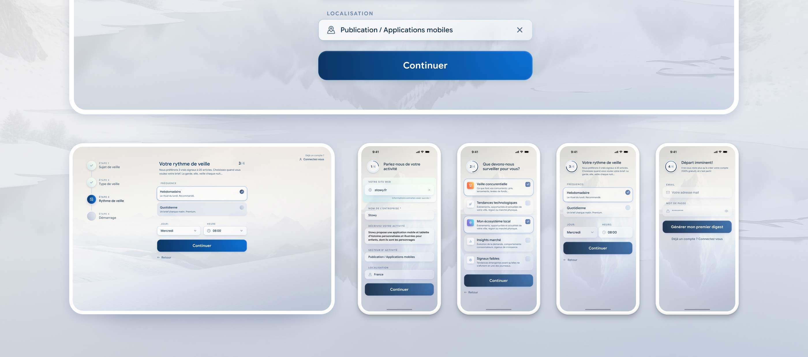
The onboarding asks for a single thing: your website. The app extracts the rest, and you confirm instead of typing. Four steps, a clear progress rail, no dead ends. And a final call to action that promises value instead of paperwork: “Generate my first digest”, not “Create an account”.

IceInsights onboarding, desktop flow IceInsights onboarding, mobile flow

The digest: focus by default

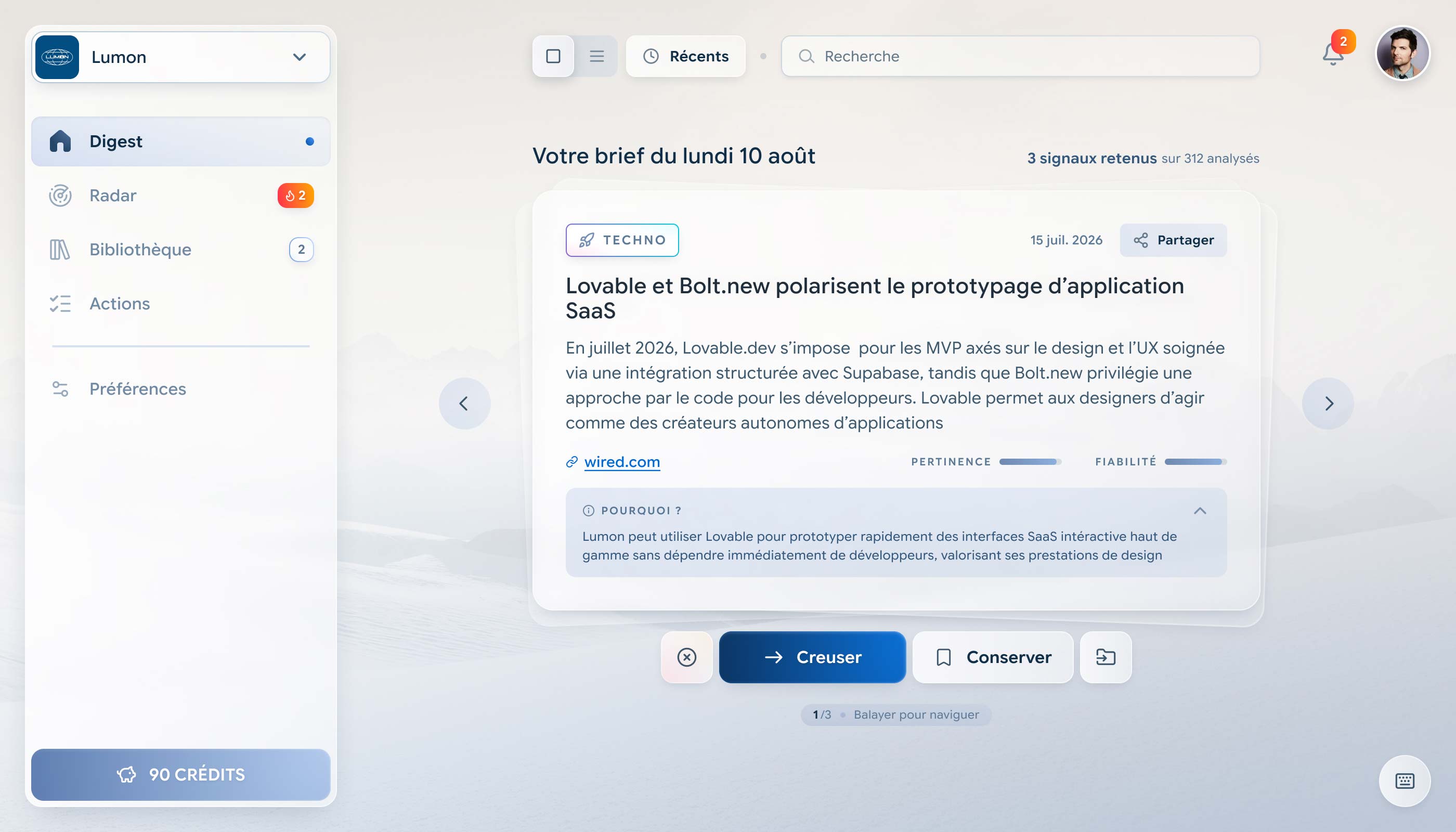
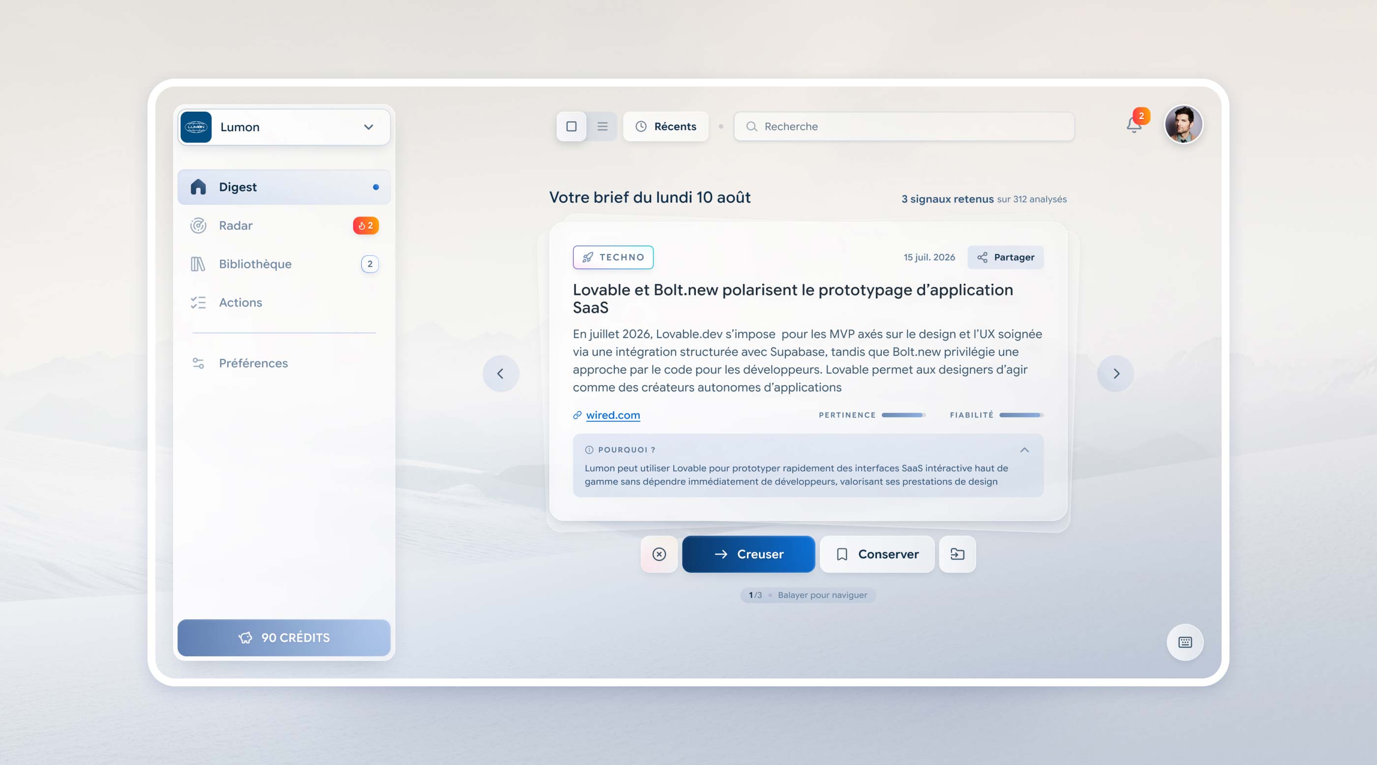
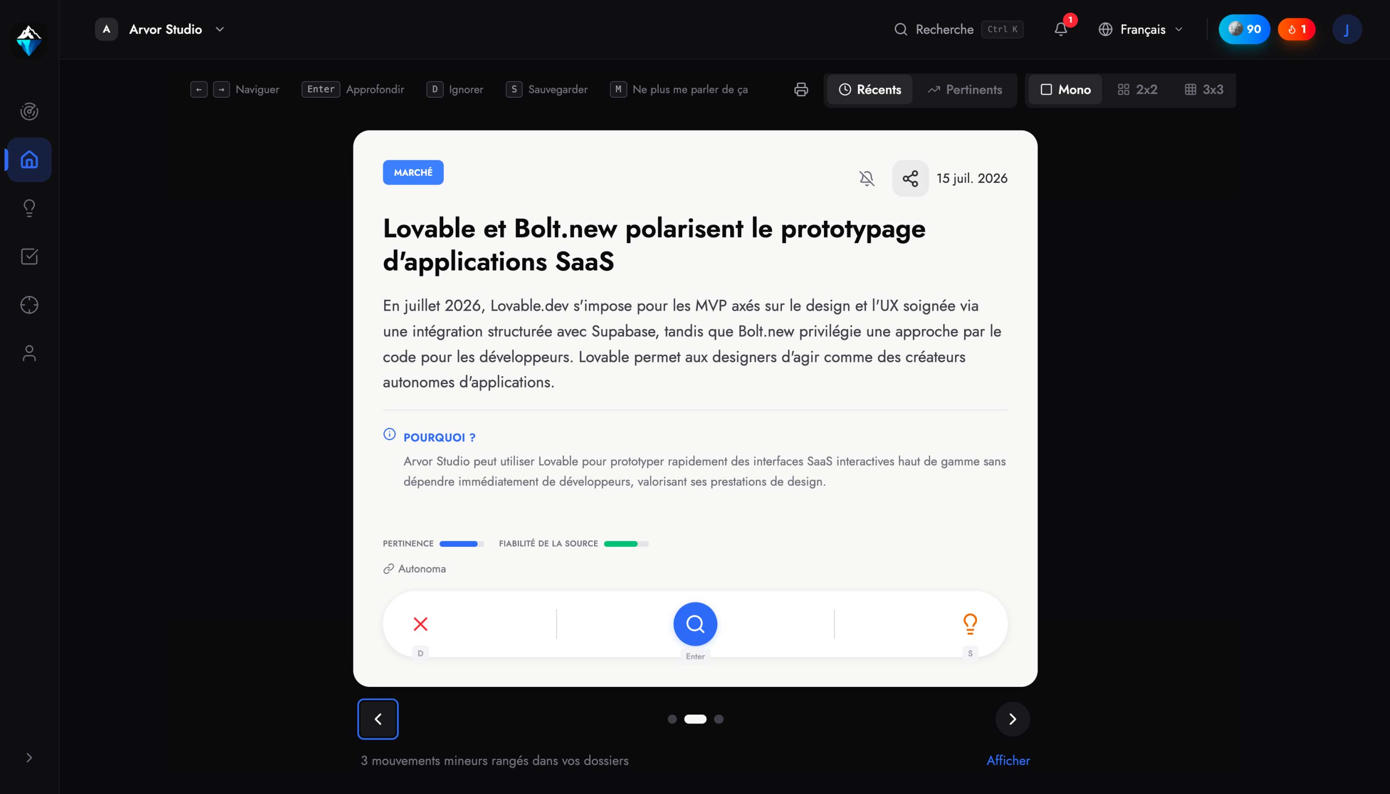
The home screen went from a swipe deck to a focused triage desk. One signal at a time, three clear actions: dig deeper, keep, dismiss. A list view for power users, and every action available from the keyboard, with shortcuts discoverable in a popover instead of permanently cluttering the screen. The transitions do the storytelling: cards settle like ice, they don’t snap.

IceInsights digest, the main screen

Status

Phase 1 is shipped: the design system (light theme), and the desktop journeys for onboarding and the digest. Dark theme and mobile are in progress, built on the same tokens, which is exactly what the system is for.

Explore the live design system here